My chosen equipment is a stool I am currently making in my Furniture Construction class. Before I made the furniture, I tried to incorporate certain ergonomic principles or anthropometric variables in the measurements of the height and width of the stool - only that it was not up to the ISO standards, but to my body's standards. :)
I took into consideration the following anthropometric variables:
1) Lower leg length - vertical distance from the floor to the lowest part of the thigh behind the knee (90 degrees of knee flexion)
2) Hip breadth - maximum horizontal distance across the hips, while sitting down
3) Body depth - horizontal distance from the rear of the knee to the back of the buttock, while sitting down
I measured the height of the stool to about 18 inches plus a cushion of about an inch. The stool is round so the diameter works for both the hip breadth and body depth, which is measured at 17 inches. These measurements are basically based on my body size, allowing me enough space to sit on the cushion and allowing my feet to touch the ground at a comfortable level.
Sunday, November 9, 2008
Cradle to Cradle.

This green book is all about "remaking the way we make things." It gives us a different perspective of recycling as opposed to upcycling - if a product does actually become more useful or harmful when it is recycled, or if upcylcing or developing a better product than that which it came from is more effective.
When we create and develop products we must be concerned of its evolution. What happens to a product once the user decides to dispose of it - does it just rot in our environment or does it help sustain our environment? This is where the question of Cradle to Grave or Cradle to Cradle becomes significant. Why not make things that once the user is done utilizing it, they can be thrown on the ground and thus sustain every living organism around it - just like nature. The book compares this relationship to a cherry blossom tree, whose "litter" sustains the soil around it, or a colony of ants - how their way of living is so sustainable that what they take from nature they give back to support the ecosystem. I mean you don't see them having a dumpsite beside every anthill right? Lol. I now have high respect for these creatures. This is apparently how nature works, and unfortunately not how man does.
The book further talks about sustainable design (like a grass roof - and no, not our nipa huts that use dried grass) and how being "less bad' just won't cut it. Here are several quotes to ponder on from the book of William McDonough and Michael Braungart:

Get "free of" known culprits. The detergent may be "free of" phosphates, but have they been replaced by something worse?
Follow informed personal preferences: prefer ecological intelligence, prefer respect, prefer delight, celebration, and fun.
Create a "passive positive" list. What, if any, are their problematic or potentially problematic characteristics? Are they toxic? Carcinogenic? How is the product used, and what is its end state? What are the effects and possible effects on the local and global communities?
Activate the positive list. Stop trying to be less bad and start figuring out how to be good. Now you set out with eco-effective principles, so that the product is designed from beginning to end to become food for either biological or technical metabolisms. (No more substituting harmful ingredients to less harmful ones).
Reinvent. Recast the design assignment: not "design a car" but "design a "nutrivehicle." Don't just reinvent the recipe, rethink the menu.
How can we support and perpetuate the rights of all living things to share in a world of abundance? How can we love the children of all species - not just our own - for all time? Imagine what a world of prosperity and health in the future will look like, and begin designing for it right now. What would it mean to become, once again, native to this place, the Earth - the home of all our relations? This is going to take us all, and it is going to take forever. But then, that's the point.


Monday, November 3, 2008
Bikram Yoga.
Bikram Yoga is yoga in a heated room. This allows muscles and tissues to become more elastic giving you more flexibility and less chance of injury. It also allows you to sweat and detox through the skin. It also improves your circulatory and cardiovascular system plus it provides other health and stamina benefits. For me though I think the most important benefit one can get from it is that it releases great stress from the mind and the body.
Below are 3 Bikram Yoga poses:

1) Dandayamana-Bibhaktapada-Janushirasana COG: the perpendicular line where the torso, head and left knee are located Size and shape of the base: long line from the hands back to the right foot Postural stress: in this position, the stomach is sucked in to create compression of the abdominal organs and to stabilize the spine
.jpg)
2) Dhanurasana COG: the upper torso of the body that pulls on the legs for support Size and shape of the base: square/rectangular shape where the abdomen touches the floor Postural stress: this position opens up the rib cage, stretches the abdominal wall, and gives the spine a 360-degree flexion
.jpg)
3) Tuladandasana COG: on the left leg standing Size and shape of the base: the left foot along with the stretched body that forms a capital "T" Postural stress: to maintain this position, the muscles of the horizontal body must be pulled on separate ends simultaneously as if in a human tug-of-war
(Photos taken from: http://www.bybtoronto.com/m_25.asp)
Anatomy, posture and body mechanics.
Activity 1: Stand with your back and heels against a wall. Now try to bend over as if you were picking something up off the ground just in front of you. What happens and why?
Answer: The further I go down, the more I tend to move forward and lose my balance. As soon as I feel I'm about to fall forward, I put my right foot in front of the other to catch myself from falling. The COG of the body must fall within the base of support (such as the feet) and postural reflexes must exist (like moving a foot forward) so that the total body mass remains balanced. If a person standing leans forward to pick up something from the ground, the pelvis moves rearward to compensate for the forward displacement of the COG of the upper body. But in this example, the wall is preventing the pelvis from making its rearward move. Hence, the body will fall over, unless a foot is placed forward - this will balance the transfer of the COG. Sufficient space around a standing body and room for the feet are therefore needed to avoid loss of balance.
Activity 2: Find a chair and place it with its back against a wall. Lean over the chair and touch your head to the wall - make your back as parallel to the ground as possible. Can you lift the chair and stand up?
Answer: Yes I did, on the first try. It was a medium to heavy-weight chair. Women can do this better than men probably because the COG of a woman's body is lower than that of a man's body. I've read that women have a bigger pelvis area (which allows women to carry a baby when pregnant) thus making her body mass concentrated on the lower portion of her body - as well as her COG. Men on the other hand, have their COG concentrated higher towards the chest area. This therefore makes it harder for them to carry something when their chest is already bent forward.
Activity 3: *I haven't done this because I don't live at my house and therefore don't think I can write on the walls... :)
Answer: The intervertebral discs in our spine have a "viscoelastic" behavior. This means that they deform initially then return rapidly to its original shape when a force is removed - elasticity. They may also become narrow as fluid is expelled and the superior and inferior vertebral bodies move closer together (when compressed), and fluid moves into the disc as the disc space becomes wider (when stretched) - viscosity. These occur as a result of the forces exerted on the spine due to daily normal activities. The shrinkage and expansion of the disc spaces change the measure of a body's stature. This is why some people are taller when they wake up in the morning than when they go to bed at night. According to the book, people are about 1% taller when they wake up and almost 50% of the stature gained is lost in the first half-hour after rising.
Sunday, October 12, 2008
{Assignment}
2.a. What is five plus two times six minus three? Answer: 14
2.b. What should you do? Will changing your mind affect your odds of winning the million dollars? Or should you just stick with door number three?
Answer: Eliminating door number 2 just increased my odds of winning because then there is a 50% chance that the door I chose has the million dollars. Door number 1 may have a booby prize or the million dollars, but door number 3 - the door I chose - also has that same possibility of having the booby prize or the million dollars. Since it's a 50-50 situation, choosing whichever door wouldn't really matter. I would choose door number 3 if that's what my instinct tells me, or I would choose door number 1 if I feel that it's a good move to change. For me it's really a matter of in which situation would I feel worse afterwards. Would I feel worse that I lost knowing I stuck by a wrong decision the whole time, or would I feel worse knowing that I had the right decision and then I changed it the last minute? Personally, the latter would probably feel worse.
P.S. After answering I was very intrigued and looked up this paradox. And I was wrong. I knew something had to be wrong. You wouldn't give it as an example or wouldn't even bother to warn us about thinking hard about this one, if it were that simple and obvious. And so I read that this is an example of conditional probability. I didn't get a high grade in my Statistics class back in college so no wonder I did not get this one. It took time for me to understand it and below is the simplest way I can explain it.
Facts:
Let's say that Door 1 - is the $1 million, Door 2 - is the duck, Door 3 - is another duck.
The host will ALWAYS show me ONE wrong door (either Door 2 or Door 3) after I've made my first decision.
Goal:
The question here is do I STAY with my original decision or do I CHANGE it - which of the two has a higher probability for success?
TO STAY A:
I choose Door 1, Host shows me incorrect Door 2 (or 3) so I THINK I have 50-50 chance so I decide to stay - and I win.
TO STAY B:
I choose Door 2, Host shows me incorrect Door 3 so I THINK I have 50-50 chance so I decide to stay - and I lose.
TO STAY C:
I choose Door 3, Host shows me incorrect Door 2 so I THINK I have 50-50 chance so I decide to stay - and I lose.
*STAYING thus has a 1/3 probability for success.
TO CHANGE A:
I choose Door 1, Host shows me incorrect Door 2 (or 3) so I THINK I have 50-50 chance so I decide to change - and I lose (whichever the case because Door 2 and 3 are both incorrect).
TO CHANGE B:
I choose Door 2, Host shows me incorrect Door 3 so I THINK I have 50-50 chance so I decide to change to Door 1 - and I win.
TO CHANGE C:
I choose Door 3, Host shows me incorrect Door 2 so I THINK I have 50-50 chance so I decide to change to Door 1 - and I win.
*CHANGING thus has 2/3 probability of success.
I am but human.
I have committed slips and mistakes in my life, some funny while some completely embarrassing.
One example may be categorized as a Description Error.
I used to work for an I.T. company and I was assigned particularly to the online movie ticketing project (similar to Fandango.com in the U.S.). One of my responsibilities was to do email technical support. It was a stressful day for me and a customer, among many others, emailed regarding a request to unlock his account. A customer who does not claim his/her ticket reservation for 3 consecutive times will have his/her account locked. It can be unlocked only by paying a certain fee.
One customer emailed requesting that his account be unlocked for so and so reasons (I don't remember what they were, since this happened years ago). I forwarded the email to our technical head because he does the unlocking of the accounts. I wrote a note on the email that here's another customer who doesn't want to pay for unlocking his account. I was complaining and sounded really irritated in my email and asked the technical guy what to do with this customer. As soon as I hit the send button, which was real close to the "To:" field, I realized that the email written there was not the technical head's email but the customer's email address! I realized that the same time I hit the button! It was too late! I apparently hit the Reply button and not the Forward button. I was freaking out, and the technical head who was just sitting beside me asked me what the problem was (we communicate via email even if we were just sitting next to each other). I told him what happened and we tried to retrieve the email, but it was just too late. The customer received it already in his inbox.
I was waiting in vain for his reply. I was afraid the issue would be escalated to my boss and I would be in big trouble. A few minutes later, the customer replied. I was so scared to read his email. And then, surprisingly, he wasn't mad! He apologized for making such a request and he said that we were probably really busy and that he hoped we would still reconsider, and added a smiley face. Boy was I relieved!! I replied back to apologize, of course, saying that we will unlock his account as soon as possible. Whew! Everyone in the technical team were just laughing about it afterwards.
This is an example of a description error because the correct action was performed on the wrong object, due to their similarities. Because I was so stressed out that day, I accidentally clicked on the Reply button instead of the Forward button, which were just beside each other and didn't look different to me apparently at that time. I didn't bother to read the email address in the "To:" field either because it looked like an email address anyway, so it probably was the correct one.
Here's a short example of Associative Activation Error. I worked for a hotel back home doing P.R. and Marketing. It was a policy to have phone courtesy regardless of your position. Always answer a phone call with, "Diamond Hotel Philippines, this is Michelle, how may I help you?" they say. It was too long so instead I say, "Diamond Hotel Philippines, how may I help you?" I do this several times a day, 6 days a week. One time the phone rang at home, and guess what I said when I picked up the receiver? You guessed right. It was embarrassingly funny.
This is an example of associative activation error because the ringing of a phone for me was already internally associated to the phrase I use at work. So regardless where I am or where the phone is ringing, I automatically say the same thing.
The most horrible error I've ever done is a Loss-of-Activation type. It is a type of error wherein I simply forgot to do something. I remembered the rest of the action, but I forgot a part of the act. I drove to the mall with a friend in my old car. We parked and I guess we were so much involved in a conversation that we stepped out and manually locked the car, as we always do, at the same time.... and then I completely froze. I realized I left the keys in the ignition! Not only that, I left the car running. Stupid you say?! Well it wasn't the first time it happened to me!! I was so frustrated that it happened to me yet again. My friend and I had to take a cab back home just to get the spare key and come back to the mall again. And my house wasn't even near the area. Ugh! That car lacked all forcing functions. It allows you to lock the car with or without the key, hence allowing the possibility that you leave it inside the car, nor did it make an alarm sound notifying that you left the keys in the ignition. The car that I have now have these forcing functions, so I've never left my keys in the car nor have I left the car running with the keys locked inside.
Monday, October 6, 2008
Revolving Door Phobia.

I've always been indifferent to doors, including the revolving ones.. until years back, when I stumbled upon a very compact automatic revolving door at a Victoria's Secret store in Chicago.
It was my first time to go through an automatic revolving door. I have never encountered one before so I did not know how it worked. I thought it was just an ordinary revolving door, which you push to get through. Anyway, this revolving door was very compact that if a lot of people were going through, you tend to be cramped in a small space while moving. Apparently this happened as I was going through. I was in front while several women were behind me. The door was moving by itself, very slowly so my first instinct was to push on the door to make it go faster. I was feeling claustrophobic so I wanted to get away from that door right away. Unfortunately, the door stopped moving and the girl behind me said in a very rude and sarcastic tone, "you're not supposed to touch it." WELL SORRY!!!!! I didn't even say anything to her, I was just furious. How was I supposed to know that I'm not supposed to touch it!?? There were no signs on the door that said "AUTOMATIC, DO NOT PUSH OR TOUCH!" At that moment I felt stupid for not knowing, but I felt furious as well because that girl did not have to be mean.
Since then I hated automatic revolving doors.
Photo taken from ccne.mofcom.gov.cn.
Sunday is Errand Day.
Yesterday was errand day for me. I had stuff to buy at the grocery plus I wanted to check out some store sales as well since I will also be in the mall area. I pretty much had a long to-do list, but I didn't want to bring my planner with me so I resorted to chunking them in my memory.
I divided them into 3 chunks: 1)Safeway, 2) Wallgreens, and 3)SF Shopping Mall. This was very easy to remember. Each chunk though is divided into several to-do/to-buy lists. Until now I even remember them.
Safeway: juice, body wash, gift cards, cookies
Wallgreens: check out coupons and buy the $1 container
SF Shopping Mall: visit Old Navy, Club Monaco and buy Panda Express gift card
If I consolidate the above lists into one list, I will definitely forget an item or two. But since I chunked them into separate store locations, I was able to remember them easily without having to write them down on paper.
My Starbucks Planner.

To date, I have 3 Starbucks Planners. I find it odd though that they don't have it here in the U.S. where Starbucks originated. Maybe Americans don't use planners, I'm not really sure...
Anyway, back home in Manila, Starbucks Planners have started a few years back. One cannot buy it (except at Ebay of course), one can only earn it. November is when Starbucks starts giving away these cards with 24 small drawings of drinks. Each time you buy a drink, you get a sticker that they put on the drawing of a cup to indicate that you're one drink down. You have to complete all cups before you get your free Limited Starbucks Planner. What I love about these planners is that they are like collectibles. Their design changes every year plus they're made of sturdy materials so that they will last you the entire year. They also have enough spaces for the dates, so you can write a lot of to-do things. Aside from that, after buying your 24th cup of coffee, a donation will be given to a project of Starbucks and Unicef that provides learning programs to underprivileged communities in my country.

Ever since my Treo broke down, I've resorted to planners to keep me reminded of things. I simply cannot own another Treo or Blackberry for that matter because I always, always drop my phone (on the floor, on the pavement, or sometimes on the wall - deliberately, haha). So since then I've been collecting the Starbucks Planner. It is very useful to me because I have a lot of to-do things. I am very, very forgetful as well. I always have to write things down because there's just so many things I have to do at the same time, that I cannot remember all of them. Sometimes even, if I do not have my planner with me, I write them on the palm of my hand. That's when I miss my Treo, but so far I'm happy with my Starbucks Planner.
Where is Zara?

Last Friday I had a whole day class. I was planning to buy an outfit for a party that night and I figured I'll just buy one after class. Unfortunately, I had to stay late in class to finish a project. When I left, I realized I had only 2 hours to buy an outfit and rush home to get ready. I was freaking out.
My class was located near Union Square so I decided to walk towards the direction. I already knew what I wanted to buy, my only problem was finding the store in Union Square - Zara. Zara is one of my favorite stores back home, in Manila, and I'm so glad that they have it in the city too. I remember the area where it was located - sort of, but I didn't remember the street name. I was sort of in a panicky mode that I was walking around for minutes and I still couldn't find it! I resorted to 411. I tried 2 calls but they weren't able to help me - to think I spent a lot for those useless phone calls! I then resorted to asking a local. I saw a girl who didn't look like a visitor/tourist so I asked her if she knew where Zara was in Union Square. She didn't know either but she was so nice enough to check her Blackberry. She told me she'll just Google it. After a few minutes, she gave me the address: 250 Post St. and I was only 1 block away from it, geez. I thanked her for helping me and I ran off to Zara.
Thank God for approachable locals, Blackberrys and Google!
Photo taken from Semaforoverde.com.
Sunday, September 28, 2008
O.C.D.
I believe I have O.C.D. "Obsessive Compulsive Disorder is an anxiety disorder marked by the presence of obsessions and compulsions severe enough to interfere with the activities of daily life. Obsessions are repeated, unwanted thoughts often related to fears of contamination. Compulsions are repeated, purposeless behaviors."
I'm not here to tell you what my habits are that are pretty much signs that I have O.C.D., except maybe for this one close-to-normal example of piling things to bring about organization in one's life.

This my work table at my aunt's place. I don't really live here so I'm staying with my aunt and using whatever furniture she has available for me. It looks really messed up but I know exactly where an item is and why it is placed there.
A) Books behind the bags are those that I don't really use at the moment. I am in the process of coming out with a book and this pile is a reminder that I have to work on this goal when I do have the time. But it is not as immediate as the piles I have in front of the TV. These are my current must-do things:
B) One pile of books and materials is for my Furniture Construction class.
C) Another pile is my Ergonomic class and Poi pile. I placed them in just one pile because there is just not enough space on my table. Besides, they have a few items only plus my classes for both are on consecutive days.
D) One pile is my library pile. These are books and research stuff I do and have to do at the library.
I assign specific days in a week to work on these separate piles.
E) Lastly, the pile closest to me is just my daily planner. It's something I have to look at everyday so I don't miss out on other important things to do.
Walking to my class.
Fridays, I have a class at Bush St. I normally take the school bus from 79 New Montgomery because that's where I go down at the Bart. The building has a computer terminal that shows bus schedules around the city - this is one example of how knowledge in the world helps me to get to my next class. But the schedule says that a bus from 79 New Montgomery to Bush will take about 30 minutes, which takes much much longer than just walking towards it.
So anyway, before my first class I researched on how to walk to my building from Montgomery Bart Station - through 511.org. I prepared information like knowing the building number and came up with other information like which street to walk through, what streets to pass by, what street to turn left to, and so on. I wrote them all down because I didn't want to memorize it. The following day, I arrived in class early. Obviously I did not get lost.
For the second class, I did not bring anymore the paper with directions. I think I threw them right after the first class. I didn't memorize the street names either and as you may have noticed, I don't remember the building number of where my class is either. All I know is that I take the exit from the bart on one corner (I don't know which exit it is) and walk towards the street on the left side. I don't remember really how many blocks I had to walk further down. All I know is that I stop as soon as I see the one and only coffee shop in that street. Then I turn left and walk further and further until I see the Academy of Art logo. And then I know, that's my building! I did not really rely much on street names and number of blocks, because that's just too much information. I instead rely on landmarks which are much less and much easier to remember.
Poi dancing.
"Knowledge how - what psychologists call procedural knowledge - is the knowledge that enables a person to perform music, to stop a car smoothly with a flat tire on an icy road, to return a serve in tennis, or to move the tongue properly when saying the phrase 'frightening witches.' Procedural knowledge is difficult or impossible to write down and difficult to teach. It is best taught by demonstration and best learned through practice... (It) is largely subconscious." - Norman

The best example I can think of for procedural knowledge is dancing poi. I've been learning poi since early this year and the most difficult challenge of all is making your left brain think and do something totally different from your right brain. Your right arm may be doing it's own thing, while your left arm is doing the complete opposite, at the same time. My mentors teach by demonstrating, some may try to write it down but generally it's not as easy doing it than reading it. It's something you cannot perfect by reading the steps over and over. It is something you have to keep practicing until you get it right. And once you do get it, it's pretty hard to explain how your arms just move along without your brain doing any work at all, except maybe to think what your next poi move will be.
This shows how such precise behavior, such as performing a difficult poi move, can emerge from imprecise knowledge, which in this case is procedural knowledge - wherein one moves effortlessly without really thinking too much of what you are actually doing.
Photo taken from Playpoi's Flickr
Monday, September 22, 2008
Affordance in toilets.
This design principle is pretty much hard for me to relate to everyday things. I guess because of the unfamiliarity of the meaning of the word. So I will try to discuss this principle in this entry so I can be more familiar with it - by talking about toilets. Haha...
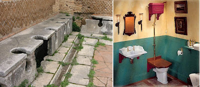


Donald Norman has talked about the U-shaped curve of complexity in his book. He says that, "the development of a technology tends to follow a U-shaped curve of complexity: starting high; dropping to a low, comfortable level; then climbing again." This is when a new object is introduced to the world and hence its newness makes it complex, since it is something we haven't seen or used before. Then through time, these objects evolve into something with a simpler structure and yet a better performance. But eventually, because of the need for increased sales and marketing, companies design more complex versions of these objects, giving it more features.

Toilets may not have started off as a complex design since they once appeared as seats with holes during ancient times. But perhaps the actual bathroom fixture with the flush feature started out as the modern and complex toilet design. Eventually, people got used to this design of the simple toilet seat with the flush. This design is an example of affordance. Just by looking at the toilet below, one can easily understand how to use it. It looks similar to a chair, so one would know that it has to be sat on (after lifting the cover of course), and it has a silver lever you push down to flush. It's very easy to use.

Nowadays I've encountered very complex toilets in public bathrooms that going to the john isn't as simple as one-two-three anymore. Well they still have those seats with holes, but the flushing system? It has gotten more and more complicated. At one of the suites in a hotel, their toilet had all these buttons on them for flushing/washing. How do use those? What are they for? There wasn't any manual beside it, and no, why would i read a manual just to pee?

In public bathrooms they have these sensor flushes that do not require any pushing of any button or lever. It was so confusing! How do I flush now? There is nothing to push to flush. There is a blinking red light, but what do I do to it? I wave my hands in front of it and nothing happened. I got so frustrated, I left the toilet unflushed. Euw. Haha. Definitely a poor example of affordance.

In public bathrooms they have these sensor flushes that do not require any pushing of any button or lever. It was so confusing! How do I flush now? There is nothing to push to flush. There is a blinking red light, but what do I do to it? I wave my hands in front of it and nothing happened. I got so frustrated, I left the toilet unflushed. Euw. Haha. Definitely a poor example of affordance.

*Photos taken from Darkcreek.com/toilets and TheDamnMushroom's Flickr
Sunday, September 21, 2008
I miss driving.
Being away from home is hard and exciting at the same time. There are a few things I miss, and that includes household help, my bed, my friends, and my car. I don't have a car here in San Francisco so I only take the Bart when I need to go somewhere. I always try to look on the bright side though - that I will not be spending expensive gas and contributing pollution to the world.


Reading on ergonomics and automobile features made me remember the most useful tool in my car. When I ride other people's car I always look for this feature, and when I don't find it, I feel a bit unsafe driving it. This feature is the parking sensor (two of them) found in my rear bumper. Below is not my car, by the way.

This for me exemplifies the design principle of Feedback and perhaps, Constraint. Watching your hood area and front bumper while parking is fairly easy considering the fact that you have already gotten used to the size and limitations of your hood and front bumper. Not for me. I have grazed my front bumper a couple of times on walls and parking islands. And it has cost me pretty much in repair and repainting. My rear bumper though is clear and un-dented - because I have built-in sensors on it. This is most useful especially when parking or backing up. It is much harder for me to guess if the rear end of my car is near or far from a wall or another parked car, than guessing from the front end.
How does it work? Well I cannot explain the technical aspects of this sensor system (I apologize). In layman's terms though, as soon as you switch your gear to Reverse, the sensor is automatically activated. It provides immediate feedback and is synchronized with user action. If all is clear at the back, the sensor is quiet. But as soon as an object (wall, car, person, cone, or dog) is within 5 feet (or so) the sensor starts beeping inside the car. You can hear it very well so you know something is back there, even if you cannot see anything obstructive on your rearview or side mirror. Your foot automatically hits the break upon hearing the "feedback" of the sensor. If you were parking, that sound is enough to let you know that you can then park and leave. But if the parking area is a bit too crowded and you want to make the most out of your free space, you can continue to backup cautiously and slowly as the sensor continues to beep. The sensor will suddenly increase the speed of its beeping giving you the feedback that you are about 1 foot away from the object behind you, and that you should stop and not backup anymore. This shouldn't be done often though, since you wouldn't want to be too close to the car behind you - because chances are, he may not have a sensor.

New sensors may come also with displays inside the car (small tv screen or a display on your rearview mirror) so those who cannot hear, can see if the sensor is detecting something nearby. This adds Visibility and Mapping to the design as you see which particular sensor is affected, so you know which area you should avoid the most. It has to be easy to understand though, to avoid further confusion and complexity to the system. I believe I'd get confused trying to interpret the display above because I'd have to think about 4 separate sensors as opposed to just considering them as one whole sensor. I don't have a display in my car, but the beeping works fine for me. I just make sure my music isn't on too loud so I hear the beeping accurately. That's not much effort to do.
This feature definitely provides good constraint as it prevents you from hitting a car behind you (not necessarily have a car hit from you behind). Although it helps to prevent you from making your own mistakes, it cannot prevent other people from making their mistakes. But let's not go into that for now. (Although car manufacturers should try to come up with more ways to prevent cars from hitting each other accidentally - I've always thought about bubble wrappings but that would make a car look funny. Lol.) Moving on... parking sensors indeed provide good constraint factors when parking your car - but not entirely, of course. These sensors don't automatically stop your car from moving and hitting what's behind you. They merely warn you so you can avoid hitting anything. Well, it has kept my rear bumper safe, so I should probably install some on my front bumper too.
Sometimes though something weird happens to my parking sensor. In certain covered parking areas, my car starts beeping wildly on reverse even if there is completely nothing at the back. Sometimes I wonder if there's a ghost standing at the back or some electromagnetic field that is causing the beeping to go off like that. It has happened to my friend too on the same parking spaces. Haven't figured it out yet.
*Photos taken from Sstatee.com
Friday, September 19, 2008
Entry or exit?
I'm not really new to the city of San Francisco, but I don't live here either. I visited the city back in 2001 and came back early this year. This is my third time here and I can't really say that I'm used to everything around here, including the Bart. But yes pretty much I know how to use the Bart system (well, almost).


*My solution? One thing I can think of is again putting screens inside the car trains (like those moving red text) to inform the commuter about succeeding stops towards the direction the train is going to. This way if the screen doesn't mention downtown S.F., then she is definitely on the wrong train. Buses have these screens, so I don't see any reason why Barts can't have them too. Buses also have these automated voices that inform commuters what the next stop will be. Barts can have these automated voices too instead of screens - if the driver doesn't want to talk at all.

One of the things I didn't have much trouble using was the entry and exit turnstiles. If it has a green light on with a white arrow showing, then it means you can enter through there. But if the red light is on with the white bar showing, it means no entry. One cannot enter through there because people on the other side use it as exit points. Basically, it's pretty much easy to understand and use... but in the few weeks that I've been riding the Bart, I've encountered a few people (5 or so) who tried entering through the exit turnstiles. Obviously their ticket is rejected and they wonder what went wrong. Some think for a moment and look around to see what's wrong, while some approach the bart personnel. One time, I was exiting a Bart station and once outside a woman asked me which way was the entrance to the bart. I told her, "any of those," pointing at the turnstiles. As I walked away, I realized I gave her the wrong answer.. it's possible that she might try to get into the bart through the exit points as a few people have done. Or she may have tried getting in without a ticket.
The bart system is fairly easy to use, considering the fact that one is used to riding it already. Apparently, it still causes confusion to some commuters, including the new ones. They don't enter/exit in the proper turnstiles. People would ask me sometimes if they're taking the right train or what is the right train to take. And I try to help them as if I've lived in this city long enough. Hehe. Anyway, what's my point... in the one month I've been riding the Bart, I've already encountered several people who have had trouble using the system. And using the design principles of Donald Norman, I will try my best to analyze the system.
Conceptual Model: The bart system has a pretty much good conceptual model. Commuters generally know which train they need to ride at a specific time. Trains are named by their last destination and based on the map below, the commuter can determine what train they should take to reach their end point. Although they have a good conceptual model, it is possible that they are lacking on other design principles that causes confusion for some commuters.

Visibility and Mapping: In the Bart station, you see the entry/exit turnstiles. You see signs to take the escalator to the train platform. Once you're waiting for the train to arrive, there are signs around the area to inform you which platform to go to, what time the next train is coming, if the next train is the train you want to take, the succeeding trains that are arriving, train schedules, and the bart map. If you're already in the train, the Bart stops have signs on the platforms so you can tell if you are already at your stop or not. Sometimes, not always, the Bart driver announces the station of the next stop or the current stop where the Bart is at. The train also has the map posted inside the cars so you know if you're near your desired station. All these visible signs and mappings are available within the Bart system that people would know their way around easily... well, almost.
One of the reasons why people get lost using the Bart system is because of vague signs. Let's talk about the turnstiles first. The color often used to mean "GO" is green and "STOP" is red. This is used in traffic lights and street signs as well. But why are people still entering on the red-marked turnstiles? Well, sometimes when people are in a hurry they don't really have time to stop and think, or choose which way to enter. They just go to the turnstile that is in their direction. Disassociation may also happen because the green and red lights transfer to different turnstiles everyday. So if you're used to entering the right most turnstile, there will come a time when that turnstile is marked red. So now your usual routine is disrupted and so you're confused which turnstile to enter - is it the red one or the green one? If you're in a hurry, you might act first before you think. So you try the next turnstile, regardless if it's green or red.
*My solution? Well, my proposed solution to this minor problem is to specifically assign turnstiles for entry and for exit permanently - to provide consistency. With mapping though, the green arrow seems to work just fine since people enter on the side that the arrow points to (because a turnstile has 2 sides). Maybe they should change the red bar (no entry sign) to a red "X" mark perhaps. Not everyone may be familiar with the no entry sign. Since entry and exit points will be permament, a sign above the turnstiles could be placed with arrows and words "Enter Here" or "No Entry" for signs going inside the platform and "Exit Here" or "No Entry" for signs leaving the platform. Visibility and correct mapping can help new commuters to exit/enter the right way. Consistency/permanency in their locations can help local commuters to better acquire an association to the proper turnstiles, and be able to enter and exit easily without having to think/choose which way to go. Traveling for me shouldn't be stressful. It should be a time to loosen up before and after a stressful day at work or school. So commuting shouldn't even be a problem-solving obstacle.
Another vague sign I noticed in the Bart are the direction signs in the platform. One side says "East Bay" and the other side says "Milbrae/SFO." I've been here for a month already and until now I'm confused what "East Bay" means or if "SFO" is the direction I'm going to. I always have to check the map before I even board the train. Apparently I'm not the only one confused. I was on a train going to Milbrae and a girl in front of me asked if this train was going to pass downtown San Francisco. She asked me this when we were at the San Bruno station already. Obviously she took the wrong train so I told her to get off the next station and ride the train on the other side of the platform. She did as she was told, but as she stepped out, she went up the escalator... hmmm.. she was supposed to take the train on the other side, not leave the bart station. She wasn't the only person to ask me about which train to take - the one on this side, or the other side, or the next one. People are generally confused on directions, despite the fact that there are maps in the area. These people aren't necessarily lazy or stupid, there just may not be proper mapping in this aspect.
*My solution? It would be good to have more visible signs of direction, because what we only see are end points and not stops in between. Most of the people who asked me for directions are going to Downtown San Francisco. Indeed, which train should one take to go downtown? Depending on where the person is, one can take Milbrae, Pittsburg, Richmond, Dublin, Fremont, and SFO - practically all trains. That is confusing. There are a few maps in the area, but sometimes they are not easy to find. Maps also indicate tracks based on color, but as the trains arrive, they are not color coded! Alas, what is one to do when the train is in front of you and not a map in sight? So, yes it would help to have these trains color coded too, to have a better association when reading the map. Additional screens in the area would also be helpful to indicate the stops where this particular train in this platform will go to and not necessarily just its end point.
Constraints happen only when you exit or enter the turnstiles - that is if your ticket has enough money your trip requires. A small screen in the turnstile will provide Feedback if your ticket is valid, expired, or if it lacks a certain amount. There are no other constraints or feedback to inform you that you are in the right or wrong direction. Well, yes there are signs you see around and information you hear about where you are going - these can serve as constraints or feedback only if you are very familiar with directions. The girl who asked me if she was on the right train to downtown obviously didn't see the station signs and the announcements as constraints or feedback that she was on the wrong train. My feedback to her was the only thing that made her realize her mistake. It is definitely not a good feeling when you're riding a train wondering if you're in the right or wrong direction.
*My solution? One thing I can think of is again putting screens inside the car trains (like those moving red text) to inform the commuter about succeeding stops towards the direction the train is going to. This way if the screen doesn't mention downtown S.F., then she is definitely on the wrong train. Buses have these screens, so I don't see any reason why Barts can't have them too. Buses also have these automated voices that inform commuters what the next stop will be. Barts can have these automated voices too instead of screens - if the driver doesn't want to talk at all.
I'm sure there are other possible solutions too, but those are what I can only think of at the moment. There are also other issues that I haven't discussed, like purchasing tickets. But that's another several paragraphs or so. I only tackled those issues I currently have problems with and thus my suggestions on how we can somehow improve on it and make commuting much easier for everyone. Although it may seem that these solutions are only helpful for newbies like me, it doesn't necessarily mean they are not helpful to other local commuters too. Newbies should not be left out in designing the system. It may take weeks to get used to knowing the Bart system perfectly, but it doesn't have to take that long. A tourist should be able to figure out the system without having to ask locals or at least with minimal help from locals. If you ask the wrong person, they just might ask you for some money in exchange.
*Photo taken from E.Johnson's Flickr, Bart.gov
Wednesday, September 17, 2008
My first entry.
This is my first time to write about ergonomics. I'm not too sure yet what to write about. I'm not that aware of objects around me that possess or exhibit the design principles of ergonomics. It's easier though to look at errors and see how it could've gone wrong or how it could've been better.

One example would probably be the Chatsworth train collision a few days ago when the Metrolink commuter train had a head-on collision with the Union Pacific freight train. It's kinda creepy because I was riding the Metrolink a few weeks ago from Camarillo to Burbank and this was the same route as the accident. It was a tragic accident, so I hope no one minds that I use it as an example.
Reports say that it was the fault of the engineer of the Metrolink train - because first, he was texting just a few minutes before the train collided (while operating the train) and second, because he missed the red railway signal which means he does not have permission to proceed. Usually though, it is what people would normally do - blame the person who most likely caused the accident. I mean, it is so easy to point at who to be blamed for. Well yes, he was not paying attention obviously because he missed the red signal, probably because he was texting. But these assumptions are basically just assumptions, whether or not he really is to be blamed for.
After reading the first chapter of the book, including the prefaces, it did give me a different perspective of looking at things around us. We cannot solely blame the driver of the train. In the first place, why design ONE rail where trains in opposite directions travel on it? Regardless of stop signs along the way, at one point two trains will collide head-on. What if the lights are broken? What if for some important reason you had to look away and miss the stop sign? These things can happen. And apparently, it did.
This railway system obviously lacks several of the design principles. One is visibility. There weren't that much visible signs that both trains were approaching each other. Maybe a stop sign here and there - but once those are missed, there were no other signs to tell that there is danger ahead. There were no signs inside the engineer's station that there was a train coming in their direction either. The only visible sign that happened was actually seeing the train in front of them, which is obviously too late to stop the accident from happening.
I guess this is also related to feedback. Since there was no feedback received at all by the engineer that what he was doing on the last few minutes was wrong, he proceeded on. Nothing told him there was danger ahead so he did not stop.
The railway system also lacked constraints. Maybe it would be expensive, but it would help prevent these kinds of accidents if there was an automatic break at the stop sign, or something that would prevent these trains from moving forward, for the very reason that there is danger ahead. Or maybe an automatic slow in the speed to inform the engineer that something was wrong.
Well these are just my personal observations. I guess it would be fair if the actual railway system was studied thoroughly to see where the real problems come from.
*Photo taken from Wikipedia.org
Subscribe to:
Comments (Atom)